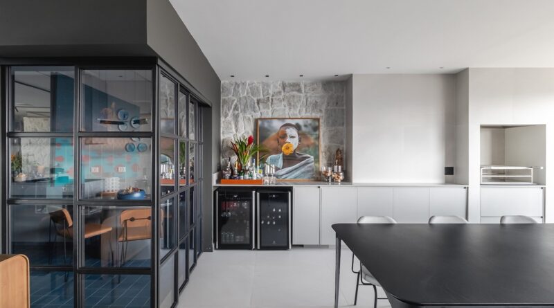
Furniture adds volume and brings out the industrial aesthetic in an apartment
The living room is the heart of this home and includes a lounge with TV, dining area and a gourmet space with exquisitely designed surrounds. The office Garden Architecture (@hortisarquitetura), managed by Fr Henrique Hortishe chose to group the furniture and unite them visually to give volume to the decoration.
The 186m² apartment, located in the Cidade Jardim area of São Paulo, hosts a couple with two children. The residents wanted an urban and stripped-down location, but full of comfort and design, so they could take advantage of the spaces.
“The project has urban inspiration and the concept high lowmixing sophisticated materials with low cost, used in a creative way,” explains Henrique. The professional received the property on the plan from the construction company and was able to execute the project more freely.
The entrance already makes an impact on those who enter the apartment. The floor and wall were covered with elastic material and the mirror creates a stunning effect on the environment. A piece of furniture for storing shoes serves as a pedestal for the selected artwork.
In the living room, the volume of the furniture was given by joining the dining table, which continues to the gourmet counter, and the sofa with a multipurpose island. The barbecue stood out as a highlight for the family, who are from Rio Grande do Sul.
The kitchen layout was changed to accommodate the use of spaces in the family’s living space. The counter space was reversed with that of the lunch room, leaving the dining room close to the social space. The focal points of the color appear on the floor and the furniture, while the cabinets and finishes bet on a neutral aesthetic.
“For us, a simple space was very important, no ‘frills’, a practical environment to bring friends and family together in an informal and cool way, but, at the same time, we wanted the environment to have an identity and a style that escaped the obvious.The result of this environment connected all these points perfect“, says Bruna, the resident.
One of the main challenges of the project was the integration of the social space. “Our strategy was to simplify the layout of the space, grouping the spaces to guarantee generous square meters, enhancing the sense of spaciousness and freedom in integration,” says Henrique.
The son’s suite is red, representing Internacional, the boy’s favorite team. Furniture with industrial and youth inspiration compose the space. In the daughter’s suite, delicacy was realized through the details of the window frames and wallpaper.
The master suite, in turn, is imposing, elegant and exudes an urban essence without sacrificing warmth and comfort. Woodwork provides texture and appears in natural veneer and smooth melamine.
#Furniture #adds #volume #brings #industrial #aesthetic #apartment
